📐 The Analyst’s Toolkit II.
Most data analysts start with a blank canvas in Tableau or Power BI. They drag a sheet, fight with containers, and hope a professional layout emerges.
The result? Static, “Excel-looking” reports that are hard to navigate and uninspiring to look at. They are functional, but they don’t inspire confidence or delight the user.
My journey into design-first analytics started during my time at Starschema, where I learned the foundational principles of dashboard UI from my former team lead, Tamas Varga (shout out to him!). That experience shifted my perspective: a dashboard isn’t just a report — it’s a product.
🚀 The Power of Simultaneous Discovery
I don’t wait for finished data to start the design, and I don’t wait for a finished design to look at the data. My process is a deliberate dual-track workflow:
- In Tableau: I dive into the raw data. I build ugly exploratory sheets to see what the distributions look like, which charts reveal the insights best, and where the story lies.
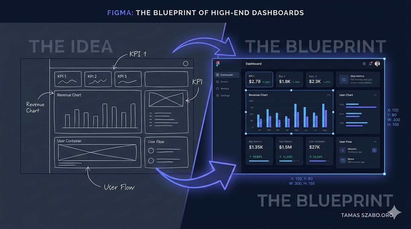
- In Figma: Simultaneously, I sketch the layout. Knowing what charts are possible lets me design containers that fit the data perfectly — rather than trying to squeeze a complex scatterplot into a tiny box later.
This back-and-forth ensures the final design is both aesthetically pleasing and technically feasible.
🛠 The Three Benefits of a Figma Blueprint
1. Performance (The Background Hack)
Tableau slows down with dozens of nested containers and images. By designing the UI — borders, headers, section backgrounds — in Figma and exporting them as a single lightweight PNG, Tableau only has to render the actual data. The result: lightning-fast load times.
2. Brand Consistency and Precision
In Figma, I define a strict Style Tile before building a single sheet:
- Typography: Clean, readable sans-serif fonts at consistent sizes.
- Palette: I source professional color palettes from Coolors to ensure perfect contrast and mood (more on that in the next post).
- Pixel-Perfect Alignment: Every element has a precise x,y coordinate and width/height. This level of obsession with alignment is what separates a report from a professional interface.
3. Stakeholder Buy-in: The “Real Data” Hook
Showing a stakeholder a polished product mockup before launch is good. Showing them their actual sales data inside that mockup is a game-changer. When they see their current numbers beautifully visualized, the conversation shifts from “Does this work?” to “When can we have this?” — and the buy-in process becomes effortless.
🏁 Final Thought
By using Figma as my blueprint, I bridge the gap between Data Analysis and Product Design — delivering solutions that aren’t just accurate, but are a genuine joy to use.
Want to build something together?
If you need executive-ready dashboards built with this approach, let's talk.
Get in Touch →