📅 The Analyst’s Toolkit IV.
Every musician practices scales. Every athlete does drills. Every writer keeps a journal.
Data analysts? Most of us wait for the next project brief.
That’s a mistake — and Makeover Monday is the fix.
🔄 What Is Makeover Monday?
Makeover Monday is a free, weekly data visualization challenge. Every week, the organizers publish a dataset and an existing chart. Your job is simple: take the data, redesign the visual, and share it.
No brief. No boss. No stakeholder asking for an Excel export.
Just you, the data, and a blank Tableau canvas.
The community has been running since 2016, with thousands of submissions published publicly on Tableau Public every week. That means you’re not just practicing in isolation — you’re contributing to one of the largest open data viz communities in the world.
🏋️ Why I Treat It as a Weekly Drill
When I joined Starschema, I was surrounded by analysts who were genuinely exceptional at Tableau. The gap between where I was and where they were felt enormous. Reading documentation wasn’t closing it. Watching tutorials wasn’t closing it either.
What actually moved the needle was deliberate repetition on real data — and Makeover Monday gave me exactly that.
Here’s what a typical week looks like for me:
That’s it. Three to four hours per week, consistently applied over months, compounds into a skill level that no course can replicate.
💡 What It Actually Teaches You
Most analysts think Makeover Monday is about making prettier charts. It isn’t. After years of doing it, here’s what it actually trains:
Critical thinking about existing visuals. Every week starts with the same question: what is wrong with this chart? After a year of asking that question weekly, you develop an instinct for spotting bad data communication instantly — in client dashboards, in board presentations, in your own work.
Speed. The self-imposed time constraint teaches you to make a good decision in two minutes rather than a perfect decision in two hours. That speed is exactly what separates senior analysts from junior ones in a corporate environment.
Breadth of data domains. One week it’s financial markets. The next it’s global health data. Then climate, then sport, then economics. Each dataset forces you to think about what chart type actually fits this data — not the chart type you’re most comfortable with.
A public portfolio, built automatically. Every submission you publish becomes a Tableau Public viz with a shareable URL. By the end of a year, you have 40+ pieces of work, spanning dozens of topics and chart types, all publicly visible to recruiters and clients.
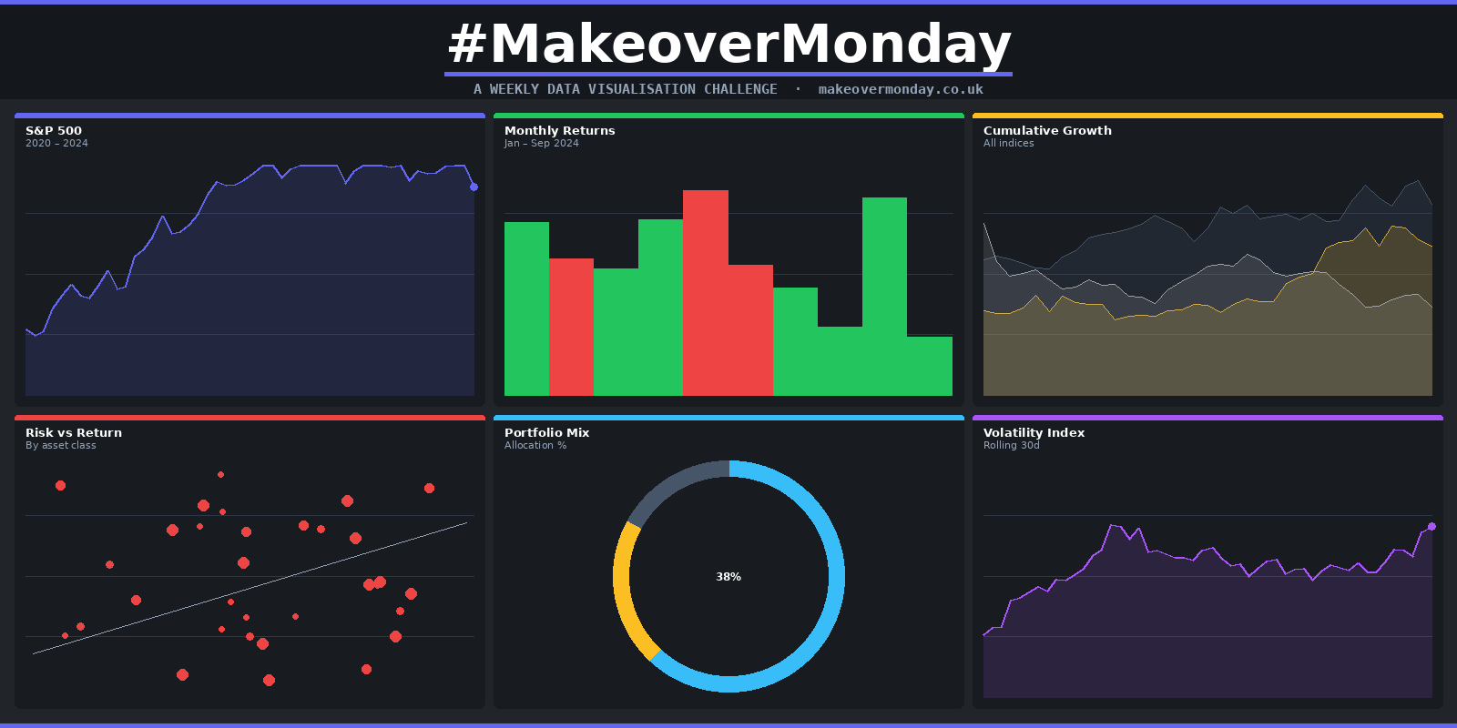
📊 My Entry: Financial Markets
To show you what this looks like in practice, here’s one of my own Makeover Monday submissions — a redesign of a financial markets dataset.
The original chart presented the data as a dense table with conditional formatting. Readable, yes. But it buried the trend and forced the viewer to do the analytical work themselves.
My redesign focused on making the market movement immediately legible — pulling the signal out of the noise so the viewer understands the story before they read a single number.

Interactive — hover over any element to explore the data. Open full screen on Tableau Public →
🚀 How to Get Started
If you’ve never participated before, the barrier is lower than you think:
- Go to makeovermonday.co.uk and download the current week’s dataset
- Open Tableau Public (free) and build something — anything — in under two hours
- Publish to your Tableau Public profile
- Share it on LinkedIn or X with the hashtag #MakeoverMonday
That’s the entire process.
💡 One rule I follow
I never look at other people's submissions before I build mine. The moment you see someone else's elegant solution, your brain stops exploring and starts copying. Protect your creative process — publish first, browse second.
🔑 The Takeaway
Tableau Public gave me the stage. Figma gave me the blueprint. Coolors gave me the palette. But Makeover Monday gave me the repetitions.
Skill in data visualization is not built by reading about it. It’s built by doing it, weekly, on real data, in public, under a self-imposed deadline — and then honestly reviewing the gap between what you made and what the best submissions looked like.
That gap closes faster than you’d expect. But only if you show up every week.
The Toolkit Series continues
Tableau Public → Figma → Coolors → Makeover Monday — the full practice stack, one post at a time.
See All Posts →Join the Challenge
Try Makeover Monday yourself
Every Monday, a new dataset. Free, open to everyone, and genuinely the best Tableau practice you'll find.
makeovermonday.co.uk →My Work
See the full archive
Every Makeover Monday viz I've published — plus executive dashboards, sport analytics, and more on Tableau Public.
View Tableau Profile →